8th February – 10th February
I expanded my moodboard to include inspirations that were closer to our vision for the scene, looking at a blend of both sci fi and gothic in things like film, 3d models of specific areas, and miniature figurines.
As stated in my next steps in my Element 1 conclusion, my first task was to create a block out that would help create a concept/foundation for creating the rest of my scene. I started blocking out by importing height maps to create a base landscape, sourced from https://www.motionforgepictures.com/environment-height-maps-free-download/.
I experimented with the height maps by changing scale and sculpting into the terrain. I used the unreal blocks to map out the basic structure of the cathedral, also using the unreal mannequin as a reference for scale.
For the water, I used the unreal water plugin and imported an ocean into the scene, a different method of creating water will be necessary for the custom appearance we need for the final look but it works well as a placeholder. I watched this video:
I preferred the larger landscapes as it framed the cathedral better but possibly makes it appear too small.
I moved onto create a spline blueprint so that I could more easily place and adjust duplicated objects.
I watched this tutorial:
Troubleshooting involved: reimporting the fence to the correct unreal scale, rotating it in the correct direction, and centring the object within maya to correct the object being far away from the spline/ offset from the spline.
Further troubleshooting is required to make them match up more closely.
11th February
Spoke to industry professional, Daniel McGarry, and received feedback on E1 outcome and concept/blockouts. I expressed my difficulties with creating a concept and he said that it’s best to use a concept from another artist as it’s something that I won’t have to do in industry. He gave Richard Wright as an example concept artist that has created works for Warhammer 40K, our main inspiration. He said that the island isn’t particularly ‘Warhammer’. So next steps is to discuss with my teammate and decide on a suitable concept to work from, instead of trying to create our own. He also said that we should pay close attention to details within our works, for example, ensuring everything is grounded within reality ensuring each of our designs makes sense in the real world. We should also be polishing textures, adding Warhammer aspects like grime, oiled/dirty/greasy surfaces and blood splatter and stains. Our work should be as good as, if not better than the original concept adding extra educated details and develop it.
11th – 13th February
Following up from the feedback, I looked at a large collection of Warhammer 40K artworks on https://40k.gallery/.
I like the city scape of this, I will be using the surrounding buildings and central walkway as inspiration.
I will be using this as inspiration for smaller buildings surrounding the main walkway and possibly use fog and smoke in a similar way to imply grandeur but also help make everything cohesive and feel like a never ending city of hell.
For the main cathedral, I will be taking shape inspiration from this and add more complex details.
I will be using this to inspire the main portal.
14th February
I asked for feedback from my lecturer, expressing my struggles with blocking out and feedback from industry professional, main points include:
- Architecture and theme will always have a basic blueprint to follow, Ancient / Gothic / Sci fi /Religious, have templates that exist.
- Take core concepts of shape language from each and constructing something ‘new’ from them.
- Just work with basic shapes in maya or unreal to nail the footprint, silhouette and scale. Before deciding on the final design.
- A lot of the determining factors will come from the emotion you want the viewer to feel: Oppression, power, ominous, humbling, scary etc. This will dictate the shape greatly, using squares, triangles, harsh angles, towering height etc.
- If you want to convey the grandiose, then the design should be unnecessarily complicated. If it’s purely functional then the design will be more simple.
My lecturer referred to the cologne cathedral as an example of grandiose:
17th February
Using the references, I created a blockout, in order to improve, I’d like to experiment with scale to make the main cathedral look most central and/or move extra buildings so they don’t disrupt the silhouette. Moving forward, I’d like to seek feedback from my lecturer about whether this scale is too ambitious and any other improvements I could make.
18th February
Before requesting feedback, I tried to implement the changes I stated earlier, I gave the cathedral a large circular base to make it look more like the main focal point and added some buildings in the background to frame it.
20th February
Feedback from lecturer on blockout:
- Replace side buildings with military defences, like cannons, guns etc. Side buildings shouldn’t be as grand as the main cathedral
- Don’t have pathways connecting to main bridge as it should be the only way into the cathedral and only path to defend.
- Instead of fogging the ground, have volcanic, basalt land then there isn’t need to build an entire city.
- push lower ground detail up (tiered foundation on cathedral further up
For landscape height maps, instead of using pre-made downloaded maps, my lecturer suggested programs that I could use to make my own:
https://www.world-machine.com/download.php
https://quadspinner.com/Download
I collected references of different military weapons, both Warhammer inspires and real life references to inform my new design choices.
27th February
I outlined the details of the front of the cathedral so I can begin my modular asset creation while keeping it to scale.
I created a rough plan for my modular assets for the cathedral, missing assets include the large towers but a separate plan will be made for more close up details.. There is a lot of ‘red’ arches, to make this less repetitive I will be adding damage and decals.
3rd & 4th March
To begin asset creation, I started with one of the most detailed aspects of the cathedral, the main portal, to set a benchmark in terms of detail and quality. I began by collecting more focused photos that looked at real life portals, concept doors and some poses I may need for the figures within the asset.
I made the archway deeper and added indents along the top of the arch where figures will sit/stand.
I then made modular trims that can be used in other areas of the cathedral to decorate edges and cover seems.
I then began adding organic figures, I utilised a free asset from sketchfab:
I posed the skeleton to fit within the gaps I made in the arch.
I was inspired by this image from an earlier moodboard to create the main focal point of my arch, I decided that I wasn’t going to use cloth to add extra detail as I have ensure this is an achievable benchmark for the rest of the project.
6th March
This is my first texture pass, I liked the contrast between the dark metal and the gold however I felt that there was too much metal and repetitive glossy materials.
In order to improve the earlier repetition, I decided to make incorporate a rough concrete texture to contrast the shiny metal, I used the same green/grey colour that George uses in his stone tile material. I also added bullet holes, scratches, and blood splats to further break the repetition but also add more interest and enhance the story.
16th March
As I have set my benchmark with the main portal, I then produced the side portals using the same method and techniques. I was able to reuse my trims from the main portal which helps make it look more cohesive. I wanted the side portals to still be fairly impressive, but also not overshadow the main portal therefore I used less skeletons to distract the eye less. Since these portals were going to be duplicated, I didn’t add as many bullet holes/scratches else it would be an obvious duplicate. Instead I will use decals to add these elements to repetitive, non unique assets.
During this process, I also moved the entire blockout into Unreal to get a better feel as to how the textures would look in the final product.
17th March
After looking more closely at my references, I decided to to create to extra variations to the arch frames as in my modular plan the same repeats for the entire cathedral except the main portal however in reality there is a lot more variation.
This is my first attempt at making a balcony fence, I didn’t like how round it was, this meant that it didn’t fit in with the rest of the assets.
This was my next attempt, this was much more successful, I liked the shapes created when duplicated. I also tried to mimic some of the shapes in George’s interior such as the spikey tips in order to better tie the two environments together.
I framed some earlier modular assets to create more interest on the wall behind the main portal.
18th March
I created two trims scaled for import to Unreal, these ones are being used to decorate the wall between the windows and the ground.
20th March
Lecturer feedback:
- Make the main door much bigger than everything else, each window/arch should lead the eye toward the main door to make it look more intimidating
1st April
I started by implementing my lecturer’s feedback by scaling the main portal and lowering the side windows.
I then moved onto making the stepped towers that frame the main portal.
When texturing I was unhappy with the texel density, even when increasing the tiling the material looked blurry. Because these assets will be close and take up a lot of space on camera i decided to go back and increase my texel density.
https://www.beyondextent.com/deep-dives/deepdive-texeldensity
I used these resources to inform my decisions.
Previous texel density:
Improved texel density:
Through increasing the number of UV maps and making the uv spacing more optimised the textures now look a lot less blurry.
2nd April
I decided to change the edgewear mask so that it didn’t cover the whole edge to make it look more realistic. I added a cloud texture multiplier to create gaps within the edgewear.
5th April
For the main upper window, I added extra detail to an existing modular asset, this way ensures cohesion and saves time.
Duplicated lower modular pieces and added adjusted modular piece, I also changed the smaller arches below the window the windows from a gold texture to a dark metal to draw more attention to the detailed arch faces.
7th April
I worked on the larger spires that frame both sides of the main building, I used parts of other modular pieces to create this, I tried to include different shapes like flat roofs to break up the repetition of the building.
I then created a simplified version of the roof decor on the Notre Dame spires, I may follow these more closely for the much larger roofs. I kept them lowpoly as they will be far away from the camera.
9th April
Added larger spires.
My aim is to get the structure fully modelled and then fix materials such as stone tile tiling so then I can also adapt them alongside adding decal details later on. It also saves time if I want to make any major changes such as completely changing entire materials but still gives a good demonstration of the final product.
I added skeletons as placeholders for where I would place statues, these will be replaces with sculpted statues if I have enough time.
10th April
To reintroduce steampunky/ functional elements I made this vent inspired by some of the 40k artworks from my moodboard.
Created an Alpha for detailed texture without extra unnecessary geometry.
In order to save on further geometry, I used a plane and added a fan image with opacity as they won’t be overly visible behind the grates. Instead of using Unreal starter assets, I imported it as a PBR with alpha blending.
FanImage found: https://www.google.com/url?sa=i&url=https%3A%2F%2Fen.dunlielectric.com%2Fproduct-detail%2F72&psig=AOvVaw1oN7cUuXYUiPm37LQiSpes&ust=1744377232790000&source=images&cd=vfe&opi=89978449&ved=0CBcQjhxqFwoTCPCZiPTFzYwDFQAAAAAdAAAAABAE
11th April
I added detail to the towers that are next to the main portal, the main change was sharpening the edges with bevels to make them stand out.
I added extra details through alphas that modify the height, I created alphas from real life gothic fencing:
I highlighted these elements in gold to match the main portal details.
I am currently not happy with the metal texture, this will be updated alongside others when I make my own metal material.
12th April
I started making the door with a low poly version which I will bake details on to. I also made a mid poly version by dividing it in maya before exporting it to Zbrush so that it will make it easier to subdivide and maintain decent topology flow.
I then went onto sculpting in Zbrush, I wanted the door to be ornate and detailed as it will be a large asset within the scene and the camera will be up close to it. I started by looking at my previous references for the earlier sculpted piece and I also gathered references of gothic patterns to inspire me.
I asked my teammate for advice on how to improve it and they suggested that I add another sculpted element to the top of the door and make the frames more interesting.
I added further detail to the inner frame before baking.
I experimented with textures:
After experimenting, I chose 3.2 for the main doors, and 3 for the side doors as they felt like they matched the rest of the building but the detail still makes it a focal point.
I fixed the tiling of the stone tiles on some of the assets and I also applied George’s gold material so our scenes better match.
Using previous modular pieces I constructed the large roof spires using references from the cologne cathedral.
13th April
I wanted to add some grime and dirt to the building similar to the soot patterns on the cologne cathedral.

I considered vertex painting however that would mean adding a lot of geometry to each object and I would like to keep my assets as efficient as possible. Therefore, I decided to use decals as it will achieve a similar effect.
I started by using different brushes in Photoshop to create a grunge map however the preset brushes didn’t achieve the look I was going for.
Therefore I downloaded a brush pack with a lot more options to create rough, grimy marks.
Brush pack: https://gumroad.com/d/85923f1efb322816afcd7fe352045f78
I created both opacity maps and albedos to create each decal. I created another moodboard to help make them more realistic.
For the bars in my window texture I used a height map,
I experimented with glass colour and I chose the blue.
17th April
Received lecturer feedback:
– add gold decals to other areas of the building, like the black metal, for balance
– When adding flooring, have height variation
– Have sculpted elements across more of the building (trimsheets)
– Set up cameras as soon as possible, where cameras are have extra interest such as gargoyles etc…
18th April
I created a substance designer materials for the outside tiles, since they are outside and the bridge is a place of battle, I wanted them to be damaged and worn. I referencecs this video below:
I aimed to make my tiles more damaged than the ones in the video, and i also wanted the grates to be brassy to match the rest of the scene.
I started with this blue/green colour however decided that it matched to much with the main building and distracted from it.
Therefore, I chose greys and browns so it no longer clashed with the building. I will adjust the colours further when more assets are in the scene so I can compare better.
I then built the arched bridges in maya, I aimed to use more square/flat roofs to break up the pointiness of the scene.
Using gradient maps in photoshop, I experimented with more muted colours for the base tile for the bridge textures.
I then moved onto sculpting detail into the entrance bridge arches similarly to the portal doors.
19th April
Added bridge decor
Experimented with adding asymmetry to the cathedral in response to my lecturer’s feedback.
Made a height map for my landscape within world machine, I wanted a steep landscape so that I could have cliff faces for basalt pillars. I referenced this video when learning how to use the software:
Imported it into unreal and applied a basic rock texture.
I played around with silhouettes using fab rocks to frame the building.
20th April
I created a multi material blueprint so that I could switch between materials when painting my landscape, I had a rock side cliff, ashy rough sand and an in between.
22nd – 23rd April
Created a tower using the spire I created in E1 and used other modular assets to add further detail. I tried to create roofing at a slant to add further leading lines to the focal point and add variety to the architecture.
24th April
Feedback from lecturer:
- Sort lighting and atmosphere, add in sky, fog and particles to get better vision of final piece
- Replace white boxing with modular pieces
- Recommended that I use landscape from chronicles of riddick (sharp jagged) to inspire my own terrain
- Add destruction
- Keep concrete colour consistent, only have two or three colour variation across materials
25th April
In response to my lecturer’s feedback I adjusted necessary concrete colours.
I began making a statue, I tried to use similar methods as George’s statues to maintain cohesion. I used shading methods and kept it relatively low poly.
26th April
I finished my statue, I experimented with new deform tools such as twist to make the spear handle.
Using modular pieces from the rest of the scene, I constructed the upper foundation.
27th April
In response to my lecturer’s feedback, I made some foundational modular structures that I compiled with new shapes and existing modular pieces.
I then imported Ultra dynamic skies in response to my lecturer’s feedback, I experimented with different daytimes and colours until I achieved something close to my lighting and fog inspirations (chronicles of riddick and secret level warhammer):
27th April- 3rd May
I began working on my landscape, collecting images of Chronicles of Riddick (inspiration recommended to me by my lecturer) and dark, volcanic ashy landscapes.
I began sculpting spikey rocks in zbrush, creating different variations to break up the landscape silhoutte. I took heavy inspiration from chronicles of Riddick as i liked how dangerous the landscape looked. I downloaded custom rock brushes to add texture to the surfaces to make them look more like rocks.
I textured each one in substance painter, using a dark ashy texture to replicate the intimidating landscape in COR.
I began importing these into Unreal, I blended my new rocks with the existing terrain by using some fab assets like rocky sand plates.
When taking a step back and looking at the scene as a whole, I felt the slanted rocks where not as effective as i hoped. They almost took your eye away from the main building. The scene also felt like it was moving further away from ‘warhammer inspired’ and i wanted to try bring that back.
I experimented by doing a paintover in photoshop, I changed the fog to a glowing green to suggest that there is some alien activity going on down below. I also changed the angles of the rocks to point towards the focus point by curving them. I also experimented with changing the colour of the sky to make it feel even more ‘warhammer inspired’ as its a colour i associate with it. I also thought it would complement nicely when the pipes filled with blood are added into the scene and the fire lighting.
3rd-10th May
I began replacing the remainder of the blockout, I created a different bridge that didn’t involve arched gaps to limit repetition.
I created the cannon island that sits next to the cathedral, inspired mostly by warhammer dioramas but also reallife military cannons and equipment.
I ensured to pay close attention to my textures throughout as it was a major part of my feedback from my previous sci-fi/cyberpunk scene. I ensured to dedicate more time to each asset texture, adding machine panels while still keeping a low poly count by using brushes with height variation (still keeping texel density in mind also) . I experimented with different edge masks such as scratched, rust, etc to add more realism and story to each asset. To take this one step further, I manually painted scratches in areas with most movement, in this example the handle has scratches on and around it. I also added decals by using a variation of alphas and normal textures to further support this.
10th-14th May
Now that I had the foundation of the main architecture of the cathedral and bridge, I wanted to start making assets that were rich in storytelling. I began by creating statues that I see as past commanders whose duties were to protect the cathedral and what’s inside. This also meant I could tie in my passion for character art in my environment and also develop skills that I have only touched upon briefly, such as midpoly character modelling and Maya nCloth.
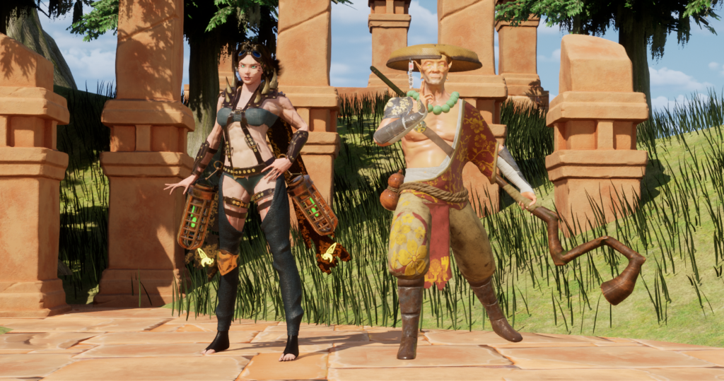
Throughout this process, I referenced mini figurines, concept work, and real life references (especially for posing) in order to better inform my design decisions, I also wanted to tie in references from Warhammer so my own style would better tie into the IP.
I began with a human posed base created from modifying the Zbrush female human and Zremeshed.
Using my moodboard as inspiration, I began building a female armour set that I would use and modify for my next female statue. Here I was messing around with nCloth physics, I found that the silk preset gave nice ruffled drapery. I encountered many problems when using nCloth, my first problem was that I made the original shape too thick so it didnt fall/drape in a natural way. It also involved a lot of messing around with settings within the nCloth itself, the nucleus and adjusting strengths of passive colliders. In every cloth shape, I created a triangle shape, so the bottom of the shape is bigger than the top so that it would gather in ruffles.
Because I chose to have the female faces exposed, I decided to create a high sculpt of the face that I would bake down onto the lower body base. I ensured to create clear planes in the face as I will be using a gold material across all of the statues, therefore details may be hard to see so i ensured exaggerate the features. I also created the flowing hair in Zbrush using the curve alpha brush as i could adjust the curve of the object easily and create natural blowing hair. Similarly to the body base, I Zremeshed the hair to lower the overall polycount.
Similarly to the rest of the assets in the scene, I paid special attention to the texturing process as that is where i was the least successful in my previous environment project. For the statues I used a normal pattern to create engravings in areas of the statue to make them more ornate and feed back into the gothic theme.
I extracted parts of this floral pattern using black masks to apply them across the statue.
I also used a couple grunge masks such as a deeply set dirt into the crevasses of the statue and an overall dusty mask to better fit into the dusty, dirty environment.
I used the same process across all of the statues, ensuring to keep them cohesive with shared armour pieces but also at the same time ensure each of them are unique.
15th May
Before creating pipes, I tested compositions in a paintover to save time
Acknowledgements
Stone material by George
Outsource Materials
https://www.fab.com/listings/06627f22-e358-42f1-8451-b3385c0c42a5